

Designed to appeal to more of the college-aged crowd, and in possession of the domain name www.nosh*t.com, the objective was to have fun with the brand without being overly crude.
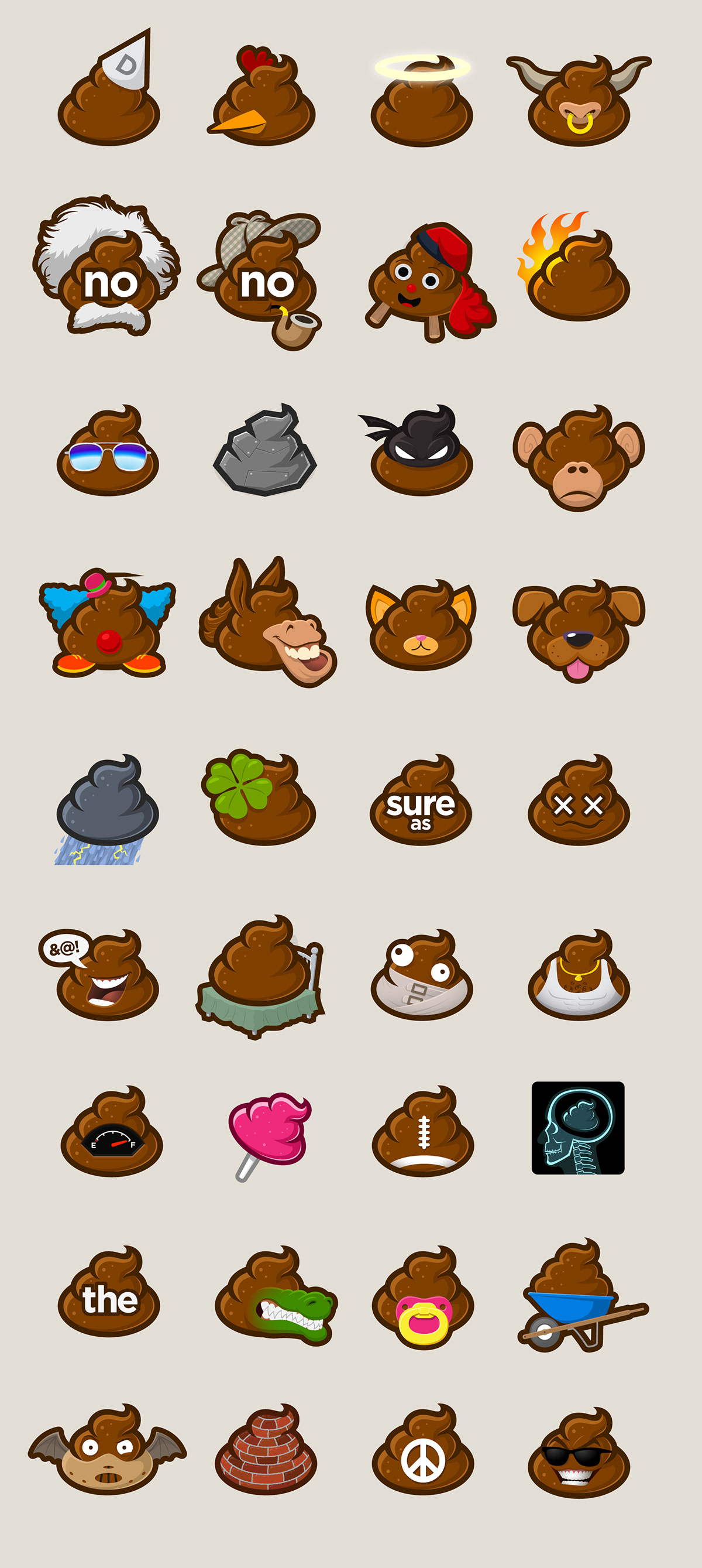
Many concepts for the logo were thrown around included a poop shape behind the international "NO" symbol but that seemed a little too cliche. Instead, something more iconic was created that just featured a lowercase "no" right in the middle. This ended up creating a symbol that looked like it had two eyes, with the "o" being the open eye and the "n" which could look like a wink.
This paved the way for putting other text on the symbol which would come into play when we got into the various icons which were part of the plan from the get go.

One of the first objectives was to design a large number of icons, each that would reference a different phrase which should become immediately obvious after seeing each one. This was a rather tame way to be a little more playful with language that under normal conditions would be considered very rude.
Here is a small sampling from the collection; yeah, I know, we had no idea how many of these it was possible to create.
The first iteration of a website for this project was around 2013 and although the designs were made quite a while ago, they still hold up today.

The first iteration of the site was more like Pinterest with a masonry grid, but later, it transitioned to more of a blog-style format to allow for specific types of ad space which were the standards at the time.

Yes, we did shirts as well.


We created an Andy Worhol-style poster that we used for marketing purposes. As you can imagine, working on this project spawned many a Beavis-and-Butthead-style laughts from the team.

Even envelopes were heavily branded and generated laughs.


